
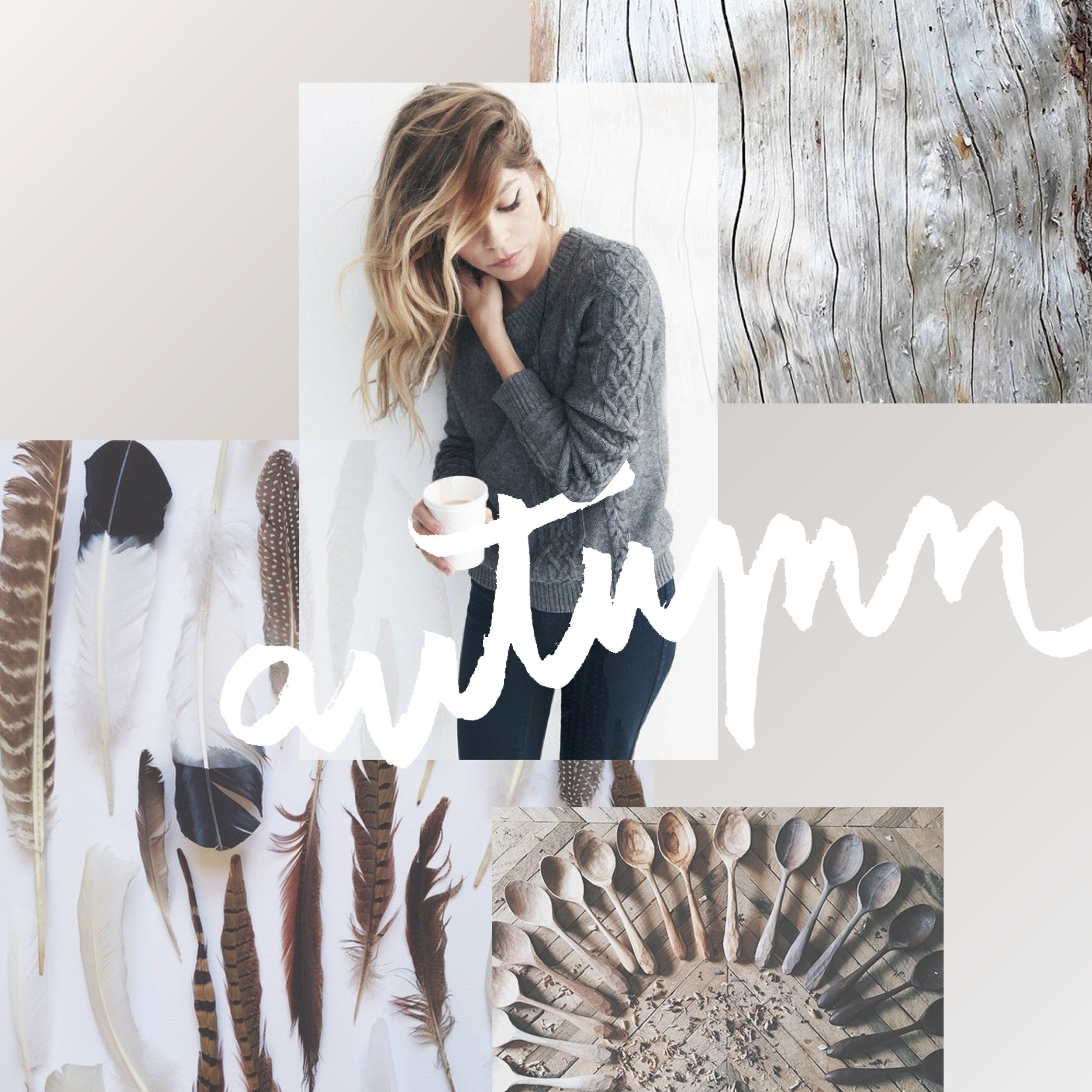
In the MOOD boards: Nursery Plans
Every experience, every step of this pregnancy has been a little adventure. Besides buying onesies and enjoying those little kicks getting stronger everyday, I'm also planning for the nursery!
As many of you have probably seen if you hang with me on social media, I'm expecting my first little one mid-August. Every experience, every step of this pregnancy has been a little adventure. Besides buying onesies and enjoying those little kicks getting stronger everyday, I'm also planning for the nursery! And since anytime I plan anything design-related, I make a mood board, I thought I'd share it here with y'all!

A cute little combo of celestial elements with natural wood and wicker elements and (of course!) plants. We are keeping the gender a surprise so this design let's us make the room a cozy fit for a newborn without the "traditional" unisex colors (who decided green and yellow were the go-to anyway??).


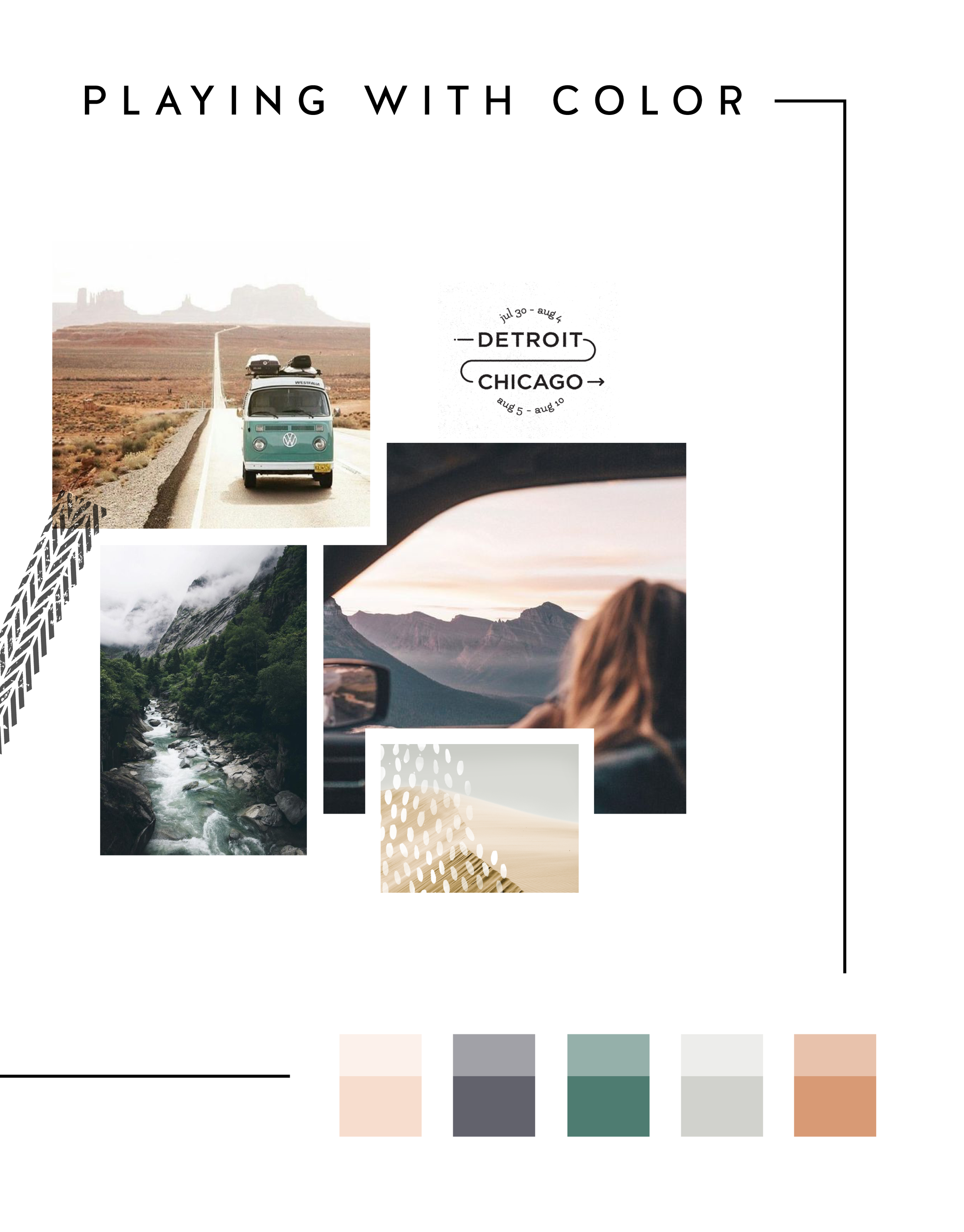
In the MOOD boards: Road Trippin'
Feeling excited for a little road trip in the works, so I created a mood board and color palette for inspiration. Deep green trees, windows down, sunsets fading into starry nights... serious design inspiration!

Related Posts


LOGO PROCESS: DEVAN DANIELLE
I had such a crazy-good time creating this little logo, and the logo process above was only step one. We took these logos, refined them and added in some really cool photo elements until we got to a really versatile final logo and matching branding elements.
Devan contacted me to create her logo and branding with some super interesting and unique ideas. She basically said, "I want you to go wild and do whatever you want."
Um, HELL YAS!
The only requirement was that she wanted the logo to feel light, airy and open. Done and done.
I had such a crazy-good time creating this little logo, and the logo process above was only step one. We took these logos, refined them and added in some really cool photo elements until we got to a really versatile final logo and matching branding elements. You should probably head over here to check out the finished project, because, well, it's just so damn lovely!
And if you feel like chatting with me about your own logo and branding, I'd love for you to holla at me!
Related Posts


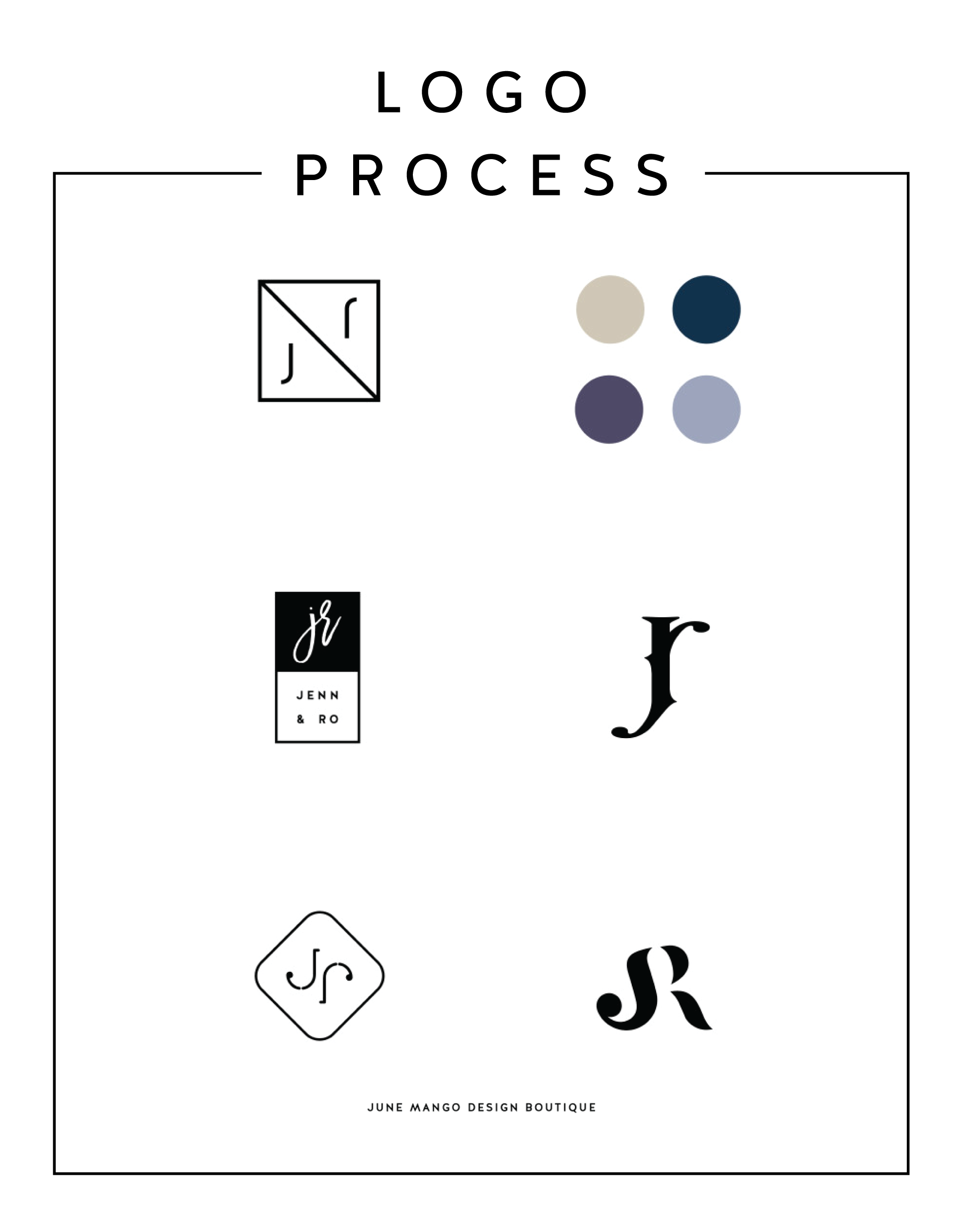
LOGO PROCESS - J&R
Just a little peek inside the process of a current logo project I'm working on right now. It's for a husband and wife photography team, and the trick is to combine the letters of their names - J and R - into a cohesive mark. It's fun and challenging. Can't wait to reveal the final logo!
Related Posts

KYLEE ACKER BRANDING PROCESS
This is a behind the scenes peek at the branding process. The goal was to really showcase her initials since this is her personal brand. The trick was to make both the K & A recognizable because each letter is of equal importance. Th color palette combines classic neutrals with a slightly feminine, but not overpowering pop of pink.

Every designer has a slightly different process. Some designers like to share just 2-3 design concepts, and some like to share 10+. I'm somewhere in the middle and tend to share 4-6. I think that gives enough variety without overwhelming my clients. Too many choices can be paralyzing and ineffective.
Remember that hella stylish mood board I shared recently? This is a behind the scenes peek at the branding process. The goal was to really showcase her initials since this is her personal brand. The trick was to make both the K & A recognizable because each letter is of equal importance. Th color palette combines classic neutrals with a slightly feminine, but not overpowering pop of pink.
Which one would you choose?