BREAKING THE BOUNDARIES OF MOOD BOARD MOSAICS
I think all designers have a touch of Creative ADD. All of my favorite designers are constantly changing and pushing their brands + the creative processes to be better, cooler, or more unique.
I have this ADD too, and recently I've been itching to bust out of the standard mood board mosaic design. It's just EVERYWHERE, and frankly, I'm bored. And here's a little secret: boredom = creativity's best friend. Being bored makes me want to shake it up! Create something new and funky! Get weird and wild! Design-wise, that is. :)
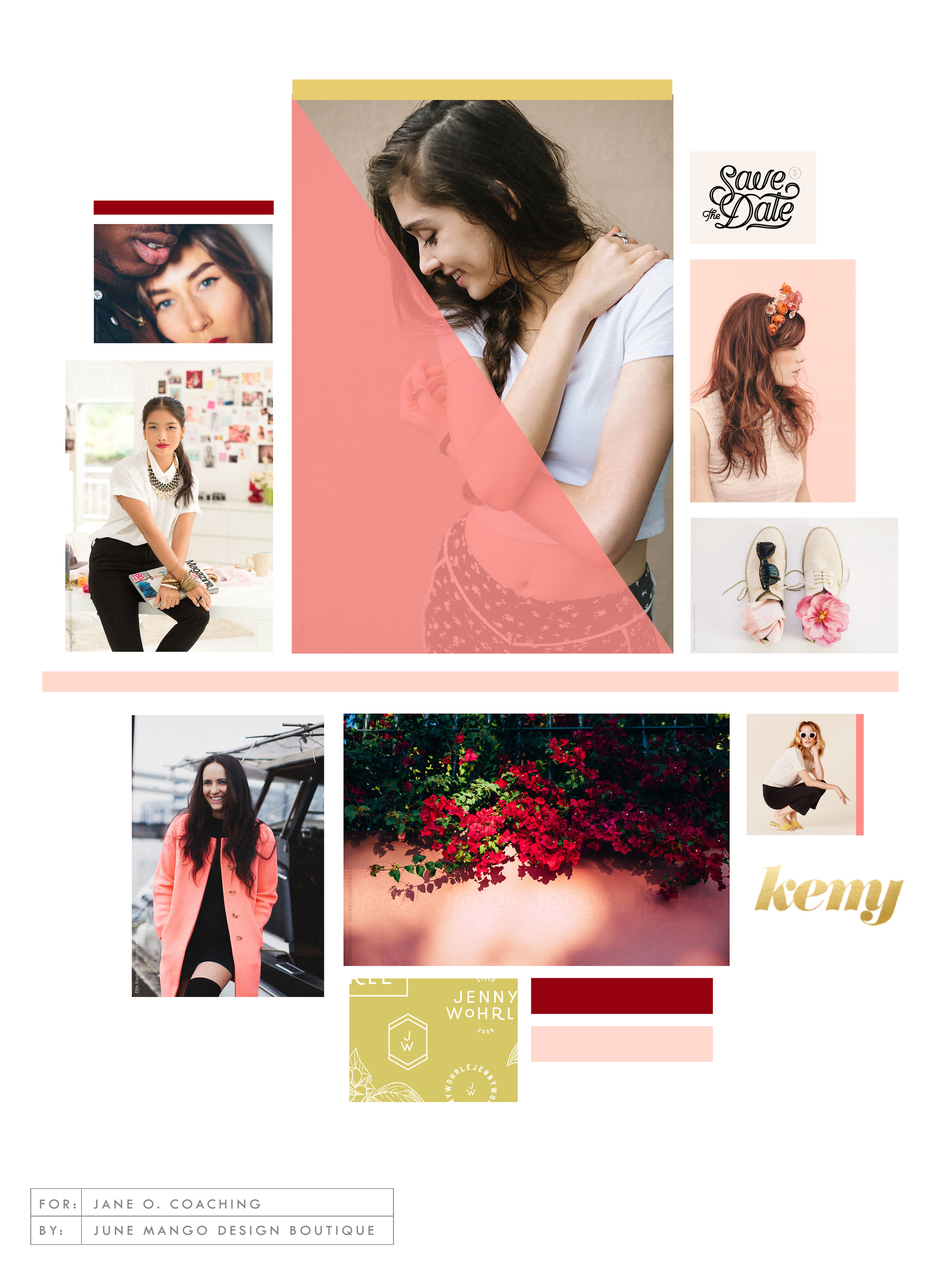
So here's where I ended up on a the new make-up of my mood boards.
Totally deconstructed. More white space, more breathing room. More color blocks, but all integrated into the collage vs. being stacked together. Still a brand-focused lifestyle image at the center grounding the collage as well as the brand. And little, layered type elements.


I think mood board collages + color are my love language. ❤️