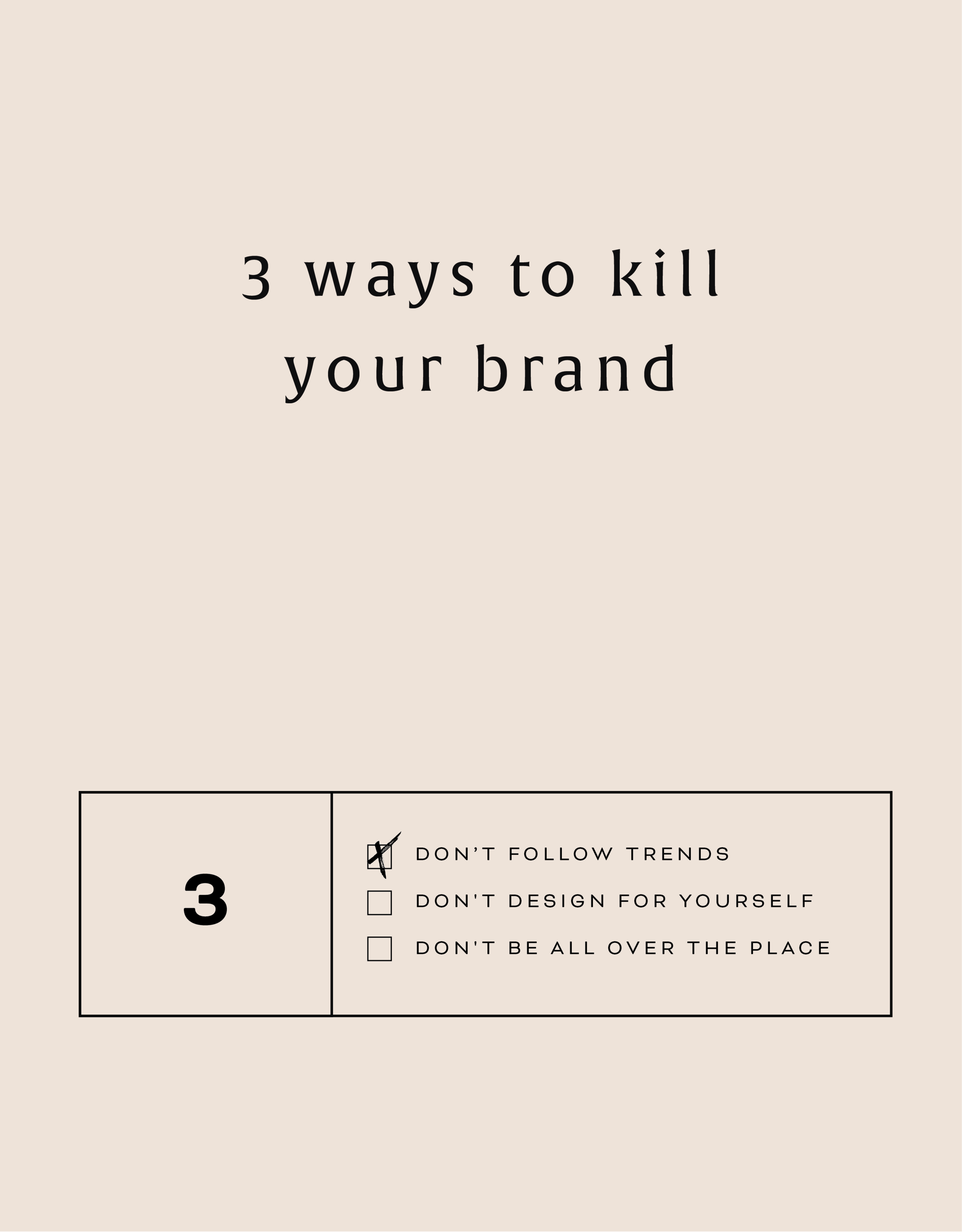
Three Ways to KILL Your Brand
Overlooking these three things in your branding can keep your brand from attracting your dream audience and yes, seriously hurt your brand. Yes you want a beautiful logo, but that logo needs to avoid being these three things first!
That title may feel a little dramatic, but a) I've been watching a lot of angsty teen movies from the 90s lately (She's All That anyone??) so it feels normal... and b) certain approaches to branding can really yield painful results. In fact, overlooking these three things in your branding can keep your brand from attracting your dream audience. Yes you want a beautiful logo, but that logo needs to avoid being these three things:
DON'T FOLLOW THE TRENDS:
You know what happens when you follow (dare I say copy) someone else's logo design? You bore people. Your dream audience takes one glance and moves on. How can you stand out when you look like everyone else?
THE FIX:
Get specific. Be who you are and share that in your brand! How would a former client describe your business? What makes you stand out? What do you deliver differently than others in your industry? Get YOU into your brand!
DON'T DESIGN FOR YOURSELF:
I see this mistake all the time. Just because you like hot pink doesn't mean it's right for your brand. Just because you like handwritten fonts doesn't mean it's right for your business if you want to attract both men and women. Just because you like something, doesn't mean your dream audience will be attracted to it.
THE FIX:
Put your audience first always! Ask yourself these questions as you go through the branding process:
What aspects (type, color, illustration, etc.) of this design will your audience be drawn to and why?
Are there any aspects (type, color, illustration, etc.) of this design that do not fit with what your audience is drawn to? If so, why?
DON'T BE ALL OVER THE PLACE
Once you've nailed down your branding elements, don't use alternate fonts, colors or imagery. It's confusing! Consistency is what builds trust online. If you aren't showing up in a consistent way (because you're using 120,567 different fonts in your Instagram posts, for example), people won't be able to recognize you or trust you.
THE FIX:
Stick with your business vision and just keep fine-tuning it, instead of backpedaling, or starting over again and again. Work with someone you trust to help you create the look or the strategy for your brand if you find yourself too immersed in it to reflect your true style and voice.
Related Posts

HOW TO CREATE A SCROLL EFFECT FOR YOUR WEBSITE MOCKUP
Since Instagram is such a great place to connect and share socially, I love sharing recent Go Live in 5 projects on there! The problem I always have with sharing websites is that it's hard to get a sense of an interactive site in a static square image. So I created a scroll effect and shared it as a video. This give a MUCH better sense of the site when you actually view it online.

Since Instagram is such a great place to connect and share socially, I love sharing recent Go Live in 5 projects on there! The problem I always have with sharing websites is that it's hard to get a sense of an interactive site in a static square image. So I created a scroll effect and shared it as a video. This give a MUCH better sense of the site when you actually view it online.
Since I've been sharing these scrolling website mockups, people just keep asking me: How do you create a scroll effect for your website mockup?? So today, I'm listing out the exact step-by-step process so you can do it, too!
*Tiny note: I use QuickTime and Photoshop for this process (and I have a Mac). This is not a sponsored post, but these are the programs I recommend.
Step 1
01. Open QuickTime
02. Click File > New Screen Recording
03. Click the red record button

04. Adjust the selection tool to crop just the screen

05. Click Start Recording
06. Scroll through the page you want to record
07. Save the recording
Step 2
01. Open Photoshop
02. Add your computer mockup to layer 1
03. Add a shape that covers the computer mockup screen to layer 2
04. Drop in your recorded file (should be mp4 format)
05. Create clipping mask that pulls the recording into the shape you created from step 03
06. Open the Timeline (usually below your art window)
07. In the dropdown that says Create Frame Animation, change that to Create Video Timeline. This will add all your layers to the timeline.
08. Pull each layer in the Timeline to match the length of your video
09. To save, click Export > Render Video
That's it!
BONUS!

Want to download the Photoshop file and save a step?


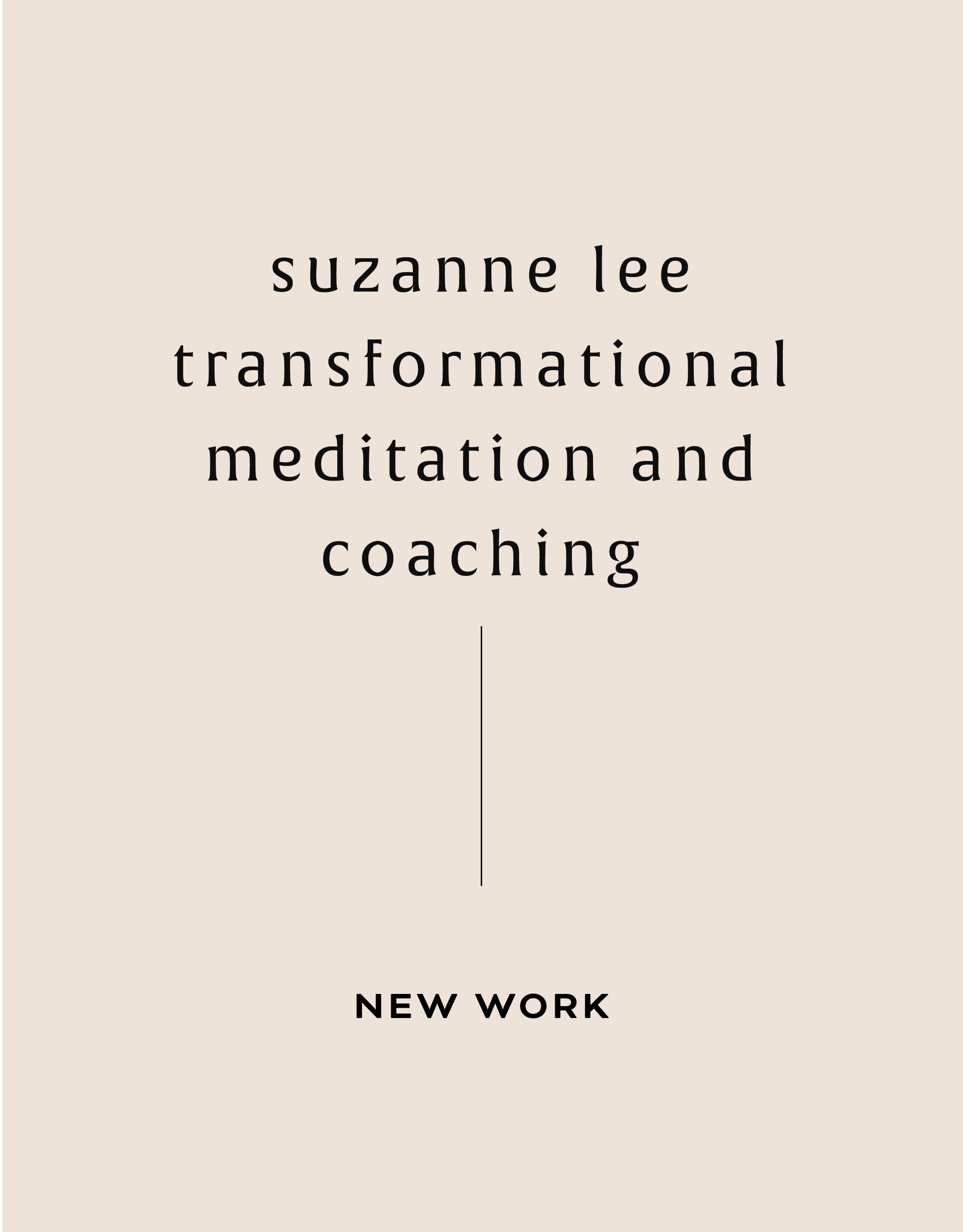
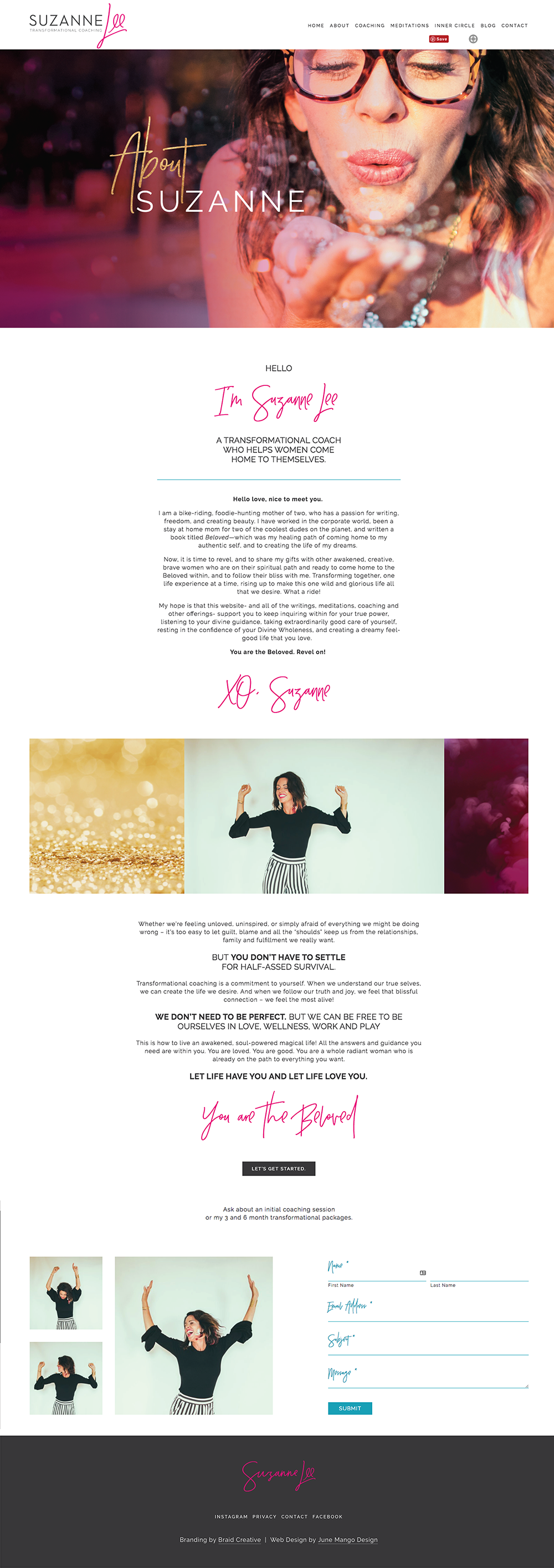
NEW WORK: SUZANNE LEE TRANSFORMATIONAL MEDITATION AND COACHING
New work! This lovely web launch for Suzanne Lee, a transformatial coach and meditation expert, is a great example of a luxurious website. Lots of opulent imagery, pretty parallax photos and beautiful branding.


Client: Suzanne Lee
Service: Go Live in 5® Web Design
Design Direction: Bold, Luxe, Light
#1 Goal: New service promotion
Timeline: 5 days
Branding: Braid Creative
URL: suzanneleecoaching.com
Related Posts

5 REASONS YOUR WEBSITE NEEDS A REDESIGN
Because you deserve a killer website to match your badass brand and business.
1 - You can't even update it If you have to call your web developer for every little text change, you should rethink your website set up. There is LITERALLY no reason for you to have any trouble updating your own site on a basic level.

1 - You can't even update it If you have to call your web developer for every little text change, you should rethink your website set up. There is LITERALLY no reason for you to have any trouble updating your own site on a basic level. With amazing platforms like Squarespace and Wordpress, you can do so much yourself without the need to be a web guru. It's so important to keep your content relevant, and redesigning your website on a new platform can really help you keep it current without breaking the bank or your site.
2 - It's not clear what you do Ask a friend to take a stroll through your website and see if they can tell you exactly what services you offer and how to buy you. This should be completely clear and easy, so if they can't you may need to rework the layout, design or call-to-actions to make sure your dream customers aren't confused, too.
3 - Your content is below the fold Perhaps you've never even heard of a "fold" referring to web design. This is simply the part of the website you see before you need to scroll. It varies depending on how big your web browser is, but it where you most important content should be, especially on the homepage. For example, if I landed on your website's homepage, would I be able to know what and how to buy your product of services? If not, you probably need to rethink your layout to push this important info above the fold.
4 - You've outgrown your website As a web designer, I am obviously able to change my website whenever I please. And this is part of the reason I have redesigned my website 3 times in less than two years. But the bigger reason is because I was swiftly outgrowing my first two sites. They didn't represent my growing brand and business anymore, not to mention that they didn't include some important web design updates (see #5 below!). But just because you're not a web designer doesn't mean you can't (or shouldn't) update your website more frequently than every couple of years. If it is out of date or no longer makes sense for your growing brand, it may be time to rework it.
5 - Your website isn't responsive This is sooooooo important. Did you count the o's in there? That's how important it is! Your website is your online business card - I say it all the time. So that means it's representing you and your business when you aren't there to do it in person. If you website is hard to read or wonky on a mobile phone or tablet, that's your dream client's impression of your business, too. On top of this, Google has now started docking points in it's search rankings for sites that are not mobile-friendly.
If any of these reasons resonated with you, I would l-o-v-e to chat with you. I am happy to walk you through the process from start to finish, look over your current website, or give you pointers on SEO. Whatever you need, I gotcher back.
Because you deserve a killer website to match your badass brand and business.
Related Posts
need even more help with squarespace?
Skip the overwhelm and have your website designed and launched in just 5 days (or less)!
LEARN MORE

2 Easy Newsletter Customizations for Squarespace
More customizations for all you Squarespace lovers today! This one changes the standard newsletter block. I find that this can be a dead giveaway that your site is built on Squarespace, so why not jazz it up? These two handy code snippets will allow you to customize your submit buttons as well as the form fields. As always, it's super easy - just copy and paste!
More customizations for all you Squarespace lovers today! This one changes the standard newsletter block. I find that this can be a dead giveaway that your site is built on Squarespace, so why not jazz it up?
These two handy code snippets will allow you to customize your submit buttons as well as the form fields. As always, it's super easy - just copy and paste! Below is the example newsletter with the design changes.
01. Newsletter Button Font
There are a few little code changes you can make to jazz up the plain "Read More" to match your branding colors. Here are the steps:
In the main Squarespace menu, click DESIGN. Then CUSTOM CSS.
Copy and paste the following code:
/*** NEWSLETTER BUTTON - TEXT AND BACKGROUND COLOR ***/
.newsletter-block .newsletter-form-button{
font-family: Kessel !important;
letter-spacing: .2em;
}
The red highlighted text is where you can change your font and background color for the button. Do not edit the other text! (You can also add this code to an individual page if you don’t want it to affect all newsletter buttons on your site).
02. Open Form Fields for the Newsletter
There are a few little code changes you can make to jazz up the plain form fields to match your branding colors and feel more modern. Here are the steps:
In the main Squarespace menu, click DESIGN. Then CUSTOM CSS.
Copy and paste the following code:
/*** NEWSLETTER FORM FIELDS ***/
.newsletter-form-field-element {
background: none !important;
border-top: none !important;
border-left: none !important;
border-right: none !important;
border-bottom: solid 3px #F2CBCB !important;
}
/*** NEWSLETTER BUTTON BORDER ***/
.newsletter-block .newsletter-form-button{
border-bottom: solid 3px #F2CBCB !important;}
The red highlighted text is where you can change your form's line color. You can also make the line thicker or thinner by changing the pixel weight (ie: 1px for thinner and 6px for thicker). Do not edit the other text! (You can also add this code to an individual page if you don’t want it to affect all newsletter form fields on your site).
And that's it!
The following information was created for use with templates made with Squarespace 7.0.
Stay tuned for more tips and tricks for the new 7.1 platform!
NEW!
A templated guide to messaging magic
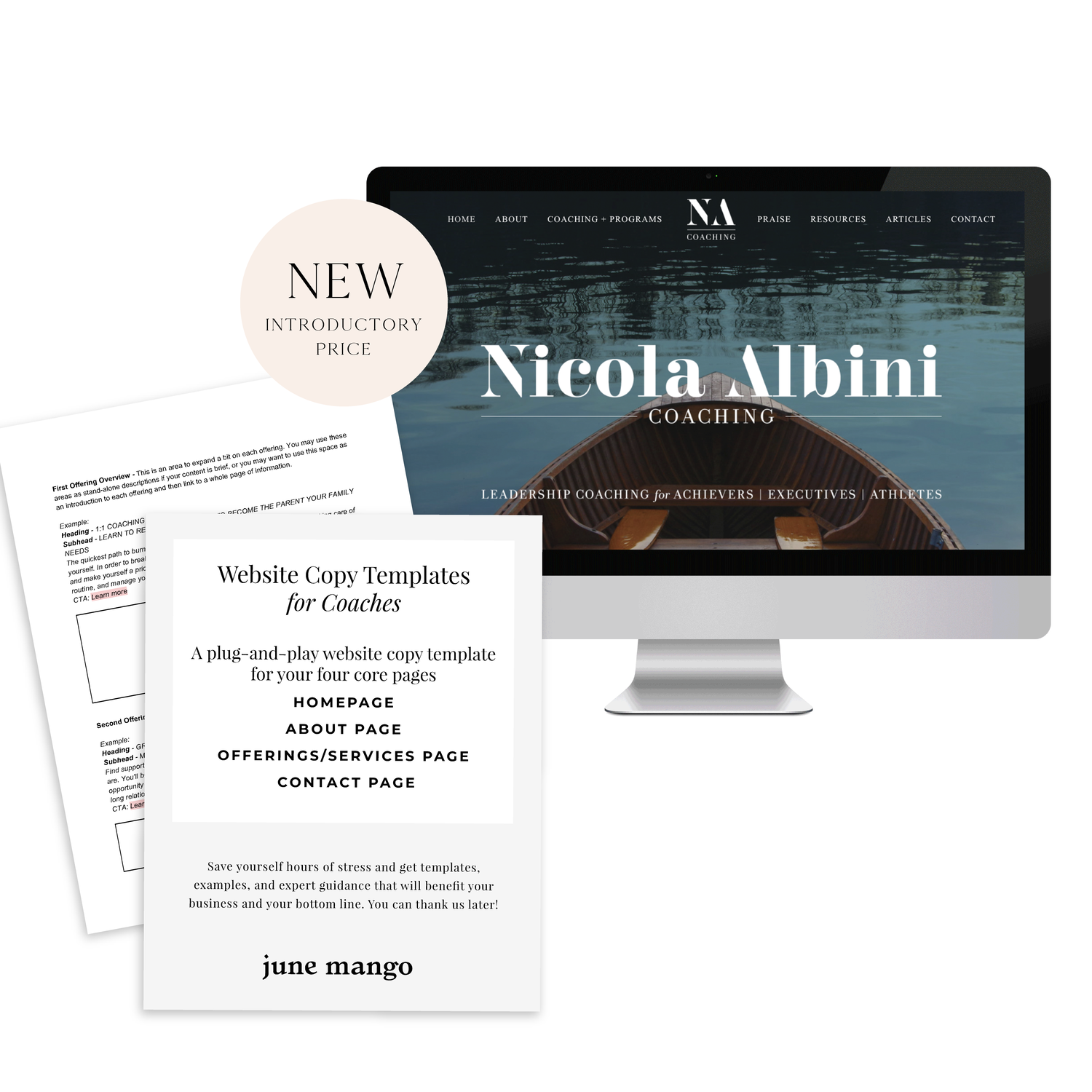
A plug-and-play website copy template for your four core pages (Home, About, Offerings, Contact). Save yourself hours of stress and get templates, examples, and expert guidance that will benefit your business and your bottom line.
LEARN MORE


I QUIT INSTAGRAM & HERE'S WHAT HAPPENED TO MY BUSINESS
Instagram, and social media in general, are helpful tools for small business owners that can provide a free marketing opportunity. But what would happen if you STOPPED marketing your biz on Instagram, Facebook or Twitter?
That's the question I wondered when I decided to quit Instagram. And what I found out about my business was a total surprise.
Instagram, and social media in general, are helpful tools for small business owners. They can provide a free marketing opportunity that gets your services or products in front of an otherwise untapped audience.
But what would happen if you STOPPED marketing your biz on Instagram, Facebook or Twitter? That's the question I wondered when I decided to quit Instagram. And what I found out about my business was a total surprise (spoiler alert: it's all OK).

My decision to take a break from Instagram came after a few things all came to a head at once:
01. I had been working hard to create new + interesting content for Instagram specifically and was beginning to feel uninspired and burnt out.
02. I had been feeling (and still do) a little bored of all the posts I was seeing. And isn't part of the point of being on Instagram to get inspired? I felt like I had seen every post on:
Cute animals ✓
Styled desk shots ✓
Anything pink ✓
Pumpkin Spice everything ✓✓✓
03. Instagram decided to shadowban some of my posts, and more maddeningly, I had no idea why! I scoured the web to see what I had done "wrong" since I wasn't buying followers or posting robot comments. I'm still not 100% sure what happened (which should be reason #4!), but it may have something to do with using hashtags that had been banned. #tgif and #dogsofinstagram are now in the group of hashtags that have been exiled. How the heck would I know that!? There are probably others that seem normal that I may have been using without knowing they were banned.
So I decided that since no one was seeing my posts due to the shadowban anyway, I would just stop posting altogether. And not only that, but I DELETED the Instagram and Facebook apps from my devices.
So what happened during the 6 week hiatus?
Nothing.
Inquiries still came in. My business kept running. And the world kept turning.
But what's more, I actually gained followers. I gained followers at a slightly higher rate than I had been before I stopped posting. I also had more free time to write blog posts, build killer websites, and watch Modern Family.
What does that mean for you and your business?
Two things:
01. It's simply worth knowing that your biz will not suddenly explode if you stop posting to social media, especially with all the other important shit you actually have to do to run a business (hello expense reports...).
02. You can let the social media part slide a little and focus on other forms of content sharing like blogging. Your website is a tool no one can take from you, so take advantage!
Want to know more about my Instagram hiatus or simply want to chat about your experience with social media? Tell me below in the comments!
Defining Your Brand Values
Are you staying consistent in the message your brand delivers? One way to be sure is by defining your core brand values. Once you clearly define your core brand values, it will be much easier to stay consistent and to promote your brand across various channels.
Are you staying consistent in the message your brand delivers?
One way to be sure is by defining your core brand values. Once you clearly define your core brand values, it will be much easier to stay consistent and to promote your brand across various channels.
In fact, this is the first step in branding. Yes you want a beautiful logo that stands out, but that logo needs to be a reflection of your unique business. Your brand is more than just a logo.

DEFINE YOUR CORE VALUES & YOU CAN:
Clarify your purpose
Attract your dream customer
Define your brand voice
Stay consistent
Grow your audience
Seth Godin wisely sums it up when he says: “A brand’s value is merely the sum total of how much extra people will pay, or how often they choose the expectations, memories, stories and relationships of one brand over the alternatives.”

Related Posts
SEO for Beginners
SEO is something everyone wants but no one fully understands.
This is partly because Google is sneaky - always changing its algorithm. It can be hard to keep up with the new rules. But there are actually some really simple tips you can use to make sure your SEO ranking is as high as possible.
SEO is something everyone wants but no one fully understands.
This is partly because Google is sneaky - always changing its algorithm. It can be hard to keep up with the new rules. But there are actually two really simple things you can focus on to make sure your SEO ranking is as high as possible:
Content
Link Building
Content
Content is king. You may have heard that phrase before and it's true for positioning you as an expert, getting hired and for ranking higher with your SEO. Below are four ways to make sure your content is fully optimized.
Blog Posts - Did you know that blog posts should be at least 300 words long? If not all of your posts are this long, no worries. But the more there is to read, the more Google will have to crawl + find your content.
Name Your Images - Give each of your images a keyword-heavy name. Why? Images are an important way of telling search engines what your website is about. Plus, Google Images is not to be forgotten! I clicked through to 100s of sites by looking through Google Images vs. the listed search results. Just make sure to use strategic keywords related to your content, and add dashes in between the words. For example, my image above would be "seo-for-beginners.png" .
Image File Sizes - Large images will reduce site speed; a key metric google uses for indexing sites. Many web platforms (like Squarespace!) automatically resize your images for you, so don't stress. But ideally, try to keep you image resolution at 72 ppi or no more than 2 MB.
Keywords - If there was one takeaway from this section it's this: ADD KEYWORDS EVERYWHERE! Your SEO keywords are the key words and phrases in your web content that make it possible for people to find your site via search engines. A website that is well optimized for search engines "speaks the same language" as its potential visitor base with keywords for SEO that help connect searchers to your site. Pages, blogs, titles, tag lines, literally everywhere. Keywords are the words clients will type into google to find you. For example, if I am adding keywords to this post, I would probably add "SEO for beginners". So I would add that to my title, 2-3 times in my actual post content, tag my images with those keywords, etc.
Link Building
Now before we dive into Link Building (aka: the process of getting external pages to link to a page on your website), I want to note that this really does take time. So don't stress if you don't have all or even any of these items set up. They are something you can work towards over time. Ok, PSA over! So let's talk link building.
Get Social - Being on several social platforms does wonders for SEO. Frankly, Google goes gaga for this. Basically, it simply means you are findable. It also lets you add your website's link with ‘high authority’ websites like Twitter and Instagram. Bonus: Add these social networks to your site to encourage that social sharing and cross-platform collaboration.
Invite Sharing - Encourage your audience to share your shit. Add easy Tweetable text with Click to Tweets, add a custom Pin It button to your images, and add sharing buttons below blog posts to encourage audience-inspired promotion.
Partnerships - Call your business bestie and ask if you can collaborate. Maybe writing a guest post for her or asking her to link out to your website as a resource are two examples of ways you can collaborate in a non-slimy way that will help you with link building. Aim for brands/businesses that have similar customer groups and find ways that each part can add value to the other. Two brands are stronger than one and the bonus is that having another person or business linking to you also positions you as an expert!
apply all of the above to increase your SEO
on your Squarespace site specifically!
Download the guide here.
need even more help with squarespace?
Skip the overwhelm and have your website designed and launched in just 5 days (or less)!
LEARN MORE
Related Posts

LOGO PROCESS: BASH EVENT PLANNING
This little logo process is from the branding process for BASH Event Planning & Design. This was a challenging but FUN design process that included ideas like topography, layering and disco!
This little logo process is from the branding process for BASH Event Planning & Design. This was a challenging but FUN design process that included ideas like topography, layering and disco!
Below are several of the concepts and variations created before we nailed down the final logo.
Related Posts
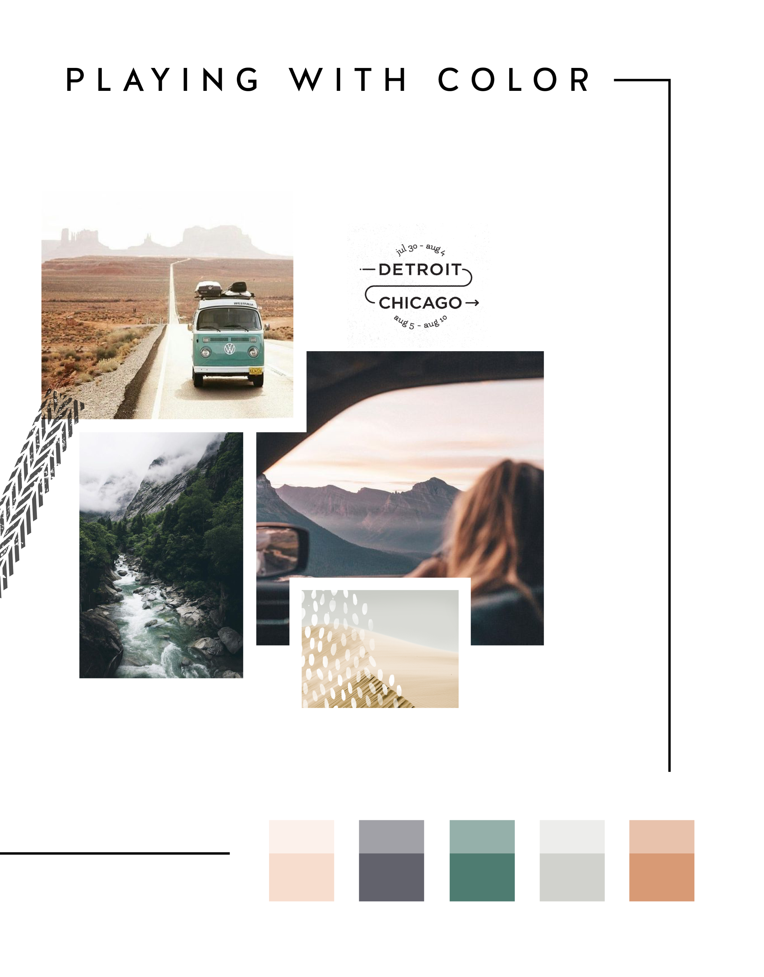
In the MOOD boards: Road Trippin'
Feeling excited for a little road trip in the works, so I created a mood board and color palette for inspiration. Deep green trees, windows down, sunsets fading into starry nights... serious design inspiration!

Related Posts
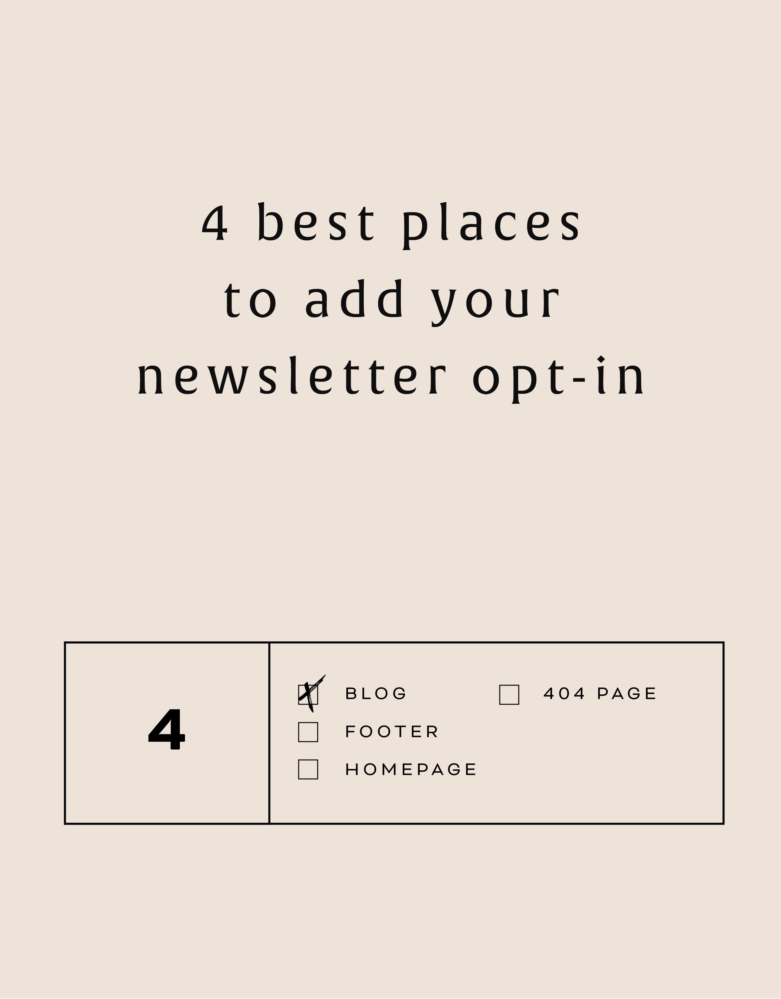
The 4 best places to add your newsletter opt-in
Growing your newsletter list is so important when you run an online business. It can help you keep in touch with your dream clients, build trust with your audience and promote new offerings. But the question my web clients always ask is: Where is the best place to add my newsletter opt-in or sign up form?
Growing your newsletter list is so important when you run an online business. It can help you keep in touch with your dream clients, build trust with your audience and promote new offerings. But the question my web clients always ask is: Where is the best place to add my newsletter opt-in or sign up form?
There are 4 places I ALWAYS add the newsletter opt-in forms on any website.
Blog
Adding the newsletter opt-in to your blog allows you to capture people who are already interested in what you have to say. They are on your blog reading all of your juicy content, so why not try to get them onto your newsletter list where you have even juicier content! I like to make sure this opt-in is specific, and maybe different from other sign up forms elsewhere on the site. For example, it should incentivize them to sign up with the promise of sharing your expertise for free with a worksheet, guide, etc. Adding this opt-in to the sidebar of your blog is one of my favorite places to engage newsletter subscribers on your site.
Footer
It's the one place people will see no matter what page of your website they land on (or click to!). So make it work for you by adding a newsletter sign up form. Repetition of views will also increase the chance that people will sign up. I like to keep this one more generic with a description of what you typically send out vs. a specific freebie or promo.
Homepage
You probably guessed this one, right? But do you know where on the homepage you should add your opt-in? The rule of thumb is above the fold
(aka: the amount of the webpage a user sees before needing to scroll down).
Ideally, you will still be able to communicate your mission statement (who you are, what you do, and who you do it for) before the newsletter. No one is going to sign up for a newsletter if they don't know who the heck you are yet! But grabbing their attention before they scroll down the page is a great way to ensure they get on your list.
404 Page
Have you given much thought to your 404 page? It's a handy little page that pops up when someone clicks a broken link or types a URL wrong. It has so much potential to be interesting and engaging, which is important for keeping your audience on your site! Besides giving them a link back to your homepage, you can also sneak in a newsletter opt-in here! It's an unexpected place to get that person to sign up.
You can add your newsletter opt-in to all four of these places or just pick and choose. Have another spot you think would be great? Let me know!
Related Posts
NEW WORK: SNOW SHIMAZU HOLISTIC WELLNESS AND YOGA
New work! This lovely web launch for Snow Shimazu, a holistic health pro and yoga expert, is a great example of a light, airy website. Lots of white space (her name is Snow after all!), gorgy parallax photos and beautiful branding.

Client: Snow Shimazu
Service: Go Live in 5® Web Design
Design Direction: Light, airy
#1 Goal: New service promotion
Timeline: 5 days
Branding: Braid Creative
URL: snowshimazu.com

Related Posts

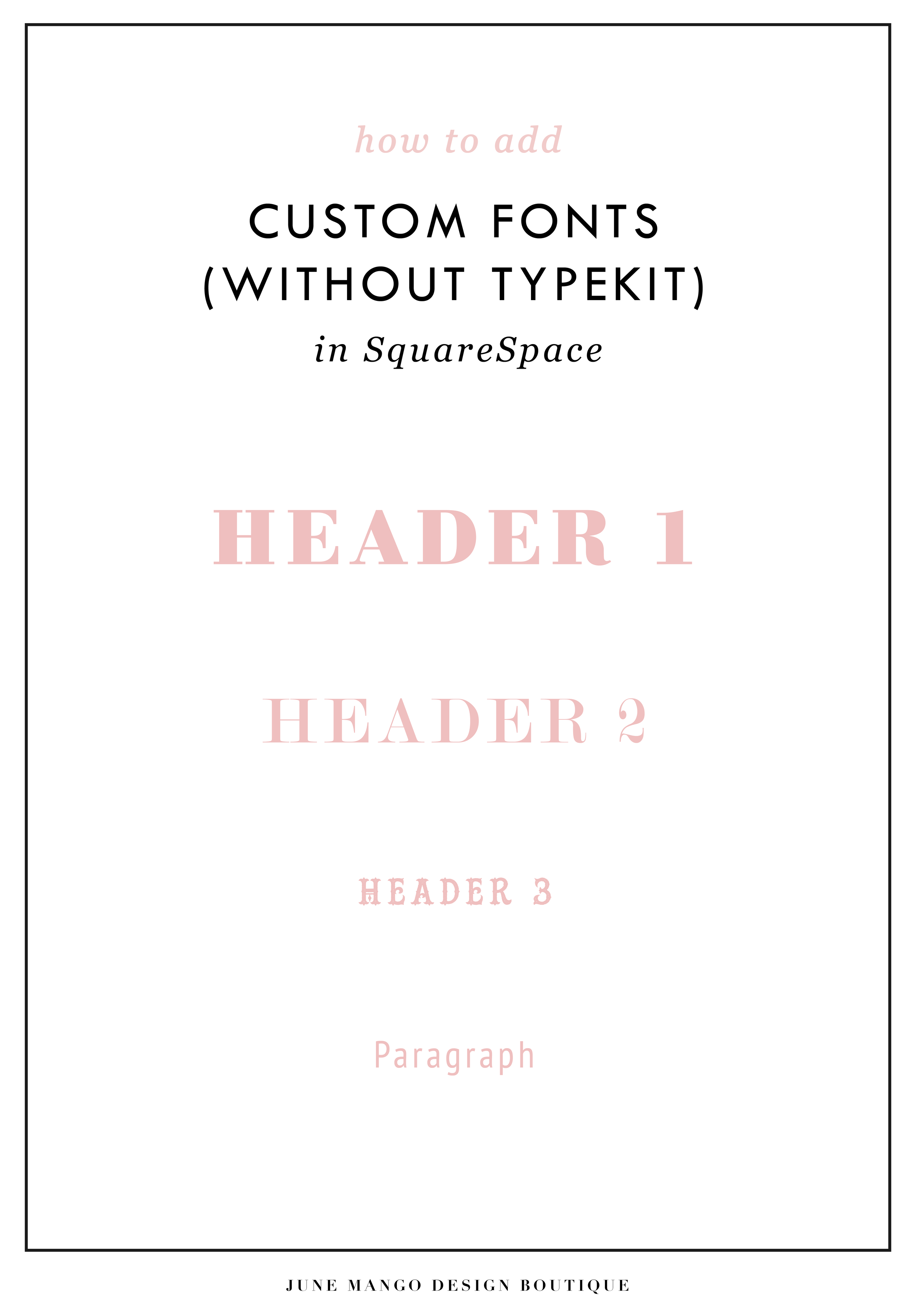
Easily Add Custom Fonts To Your Squarespace Website Design (WITHOUT TYPEKIT)
So you've just been given a beautiful new branding package from your designer full of brand new fonts and everything else. But now you're stumped as to how to add these custom branded fonts to your Squarespace site. But I've gotcher back with a Squarespace hack for you that will bring those branded fonts to life online!
So you've just been given a beautiful new branding package from your designer full of brand new fonts and everything else. But now you're stumped as to how to add these custom fonts to Squarespace. But I've got your back with a Squarespace hack for you that will bring those branded fonts to life online! This little Squarespace hack took me a long time to discover (*covers eyes in shame*)... which is crazy because it's actually pretty simple! It just takes a few simple steps and a little custom code. But anyone can do it! I promise.
Read on for the full tutorials to learn how to add custom font to Squarespace 7.0 and 7.1.
HERE ARE THE STEPS for 7.0:
In the main Squarespace menu, click DESIGN. Then CUSTOM CSS.
Below the CSS editor, click MANAGE CUSTOM FILES.
Then upload your font file (this is a file with an extension of .ttf or .otf)

Copy and paste the following code into the CSS editor:
@font-face {
font-family: 'FONT NAME';
src: url('FONT GOES HERE');}
Change the text that says FONT NAME to the name of your custom font
Highlight the text that says FONT GOES HERE. Then click MANAGE CUSTOM FILES and click on the font you uploaded in the steps above. FONT GOES HERE should now be replaced with a url.

Repeat this step with all of your custom fonts.
Once you have all of your fonts uploaded and added to the CSS code, it's time to make them replace the default Squarespace fonts. To do this, copy and paste the code below into the CSS editor:
h1{ font-family: 'FONT NAME' !important;}
h2{font-family: 'FONT NAME' !important;}
h3{font-family: 'FONT NAME' !important;}
p{font-family: 'FONT NAME' !important;}
You can still adjust the settings of each font in the regular style editor (ie: font size, letter spacing, etc). Make sure to click Save at the top of the Custom CSS page. That’s how to add custom fonts to Squarespace 7.0.
Huzzah!
HERE ARE THE STEPS for 7.1:
Repeat the steps above with all of your custom fonts.
(Because Squarespace 7.1 has 8 different font and heading sizes, you have a couple of additional optional lines of CSS to add depending on which size font you want use to add your custom font to Squarespace.)
Once you have all of your fonts uploaded and added to the CSS code, it's time to make them replace the default Squarespace fonts. To do this, copy and paste the code below into the CSS editor:
h1{ font-family: 'FONT NAME' !important;}
h2{font-family: 'FONT NAME' !important;}
h3{font-family: 'FONT NAME' !important;}
h4{font-family: 'FONT NAME' !important;}
p1{font-family: 'FONT NAME' !important;}
p2{font-family: 'FONT NAME' !important;}
p3{font-family: 'FONT NAME' !important;}
p4{font-family: 'FONT NAME' !important;}
You can still adjust the settings of each font in the regular style editor (ie: font size, letter spacing, etc). Make sure to click Save at the top of the Custom CSS page. That’s how to add custom fonts to Squarespace 7.1.
Don’t forget to refresh your website design and test out the new fonts.
Once you have added the custom fonts to your Squarespace website design, you can begin to test out the new look. Refresh any areas of your site that feature text and check for font rendering issues – if everything looks good, then congratulations – you have successfully added custom fonts to your Squarespace site!
need even more help with squarespace?
Skip the overwhelm and have your website
designed and launched in just 5 days!

BRANDING FOR YOGA EXPERTS
Whether you’ve just launched your own yoga studio or are a seasoned veteran looking for a brand refresh, there are four main ideas to help you find your focus. I have 4 simple, actionable tips you can use for your own yoga brand.
Whether you’ve just launched your own yoga studio or are a seasoned veteran looking for a brand refresh, there are four main ideas to help you find your focus.
1. Be distinctive
What makes you unique? What is the thing that makes your yoga studio stand out from all the rest? What makes your clients love you and your approach? Are your classes challenging and invigorating? Do you specialize in restorative yoga and massage? Whatever makes you and your yoga studio stand out - embrace it!
2. Brand that thing!
How do you take your unique-ness (see above!), and turn it into the most beautiful yoga logo and branding ever?
Answer: Emotion. Find that emotional connection your yoga expertise has with your clients. A stressed out mom has been looking for that holistic and healthy time for herself. She needs that calm feeling she has after your class, which keeps her coming back. Allow your branding to reflect that calming effect you bring to your yoga classes. Show this client and any other that when they take your yoga class, your practice will will bring them clarity and connection to themselves.
You create an emotional connection through your branding based on the layout, colors and fonts you choose to marry into a uniquely perfect fit for your business. Done right, clients will have a sense of your yoga teaching style before they even step foot in the studio.
3. One step further
As the smart business owner you are, you know that the logo isn't the end of the proverbial deisgn road. Social media (header images, profile pictures, behind the scenes Instagram shoots), business cards and your website are all places to carry over your branding. Think about each client’s experience from beginning to end. From booking a class to store front signs, pull everything together and review what you have. Make sure to ask yourself every step of the way if it sends the signals to the right kind of clients. In the end, it should all be in line with your vision, mission and style.
Looking for examples of a yoga expert’s branding in action? Head on over here or here or here!

MAKING DESIGN TRENDS UNIQUE TO YOUR BRAND - PART 2
In my last post, I went over how to jazz up some common design trends and make them unique to your brand. I'm diving back into today with some common design trends that I see ALL OVER Pinterest. Especially for wedding pros and boss ladies, these trends are HOT. But I'll show you how to make them distinctive so that you and your brand stand out.
In my last post, I went over how to jazz up some common design trends and make them unique to your brand. I'm diving back into today with some common design trends that I see ALL OVER Pinterest. Especially for wedding pros and boss ladies, these trends are HOT. But I'll show you how to make them distinctive so that you and your brand stand out.
Design trend #1: Watercolor er'thing

Logos by KimberlyPaigeDesigns & Autumn Lane Paperie
There a few great creative brands that can utilize watercolor elements well like artists, wedding industry pros, and brands that cater to babies or kids. But what if you want to up-level the watercolor game for your own brand? Here's how.
A: Layer up! Adding some additional color and texture will help add more visual interest to the logo. You can even add a little details, like the trees in this logo by Happily Ever After Etsy above. Darker colors will also add more sophistication and maturity to the logo.
B: Define it's shape!Instead of creating a simplified watercolor swatch, try creating a watercolor elements in the form of an item related to your business or brand. West End Girl Studio does this well in the logo above with watercolor leaves.
Design trend #2: Floral er'thing

Logos by Arlyne Grace Design & Elle & Co.
Ahh... floral motifs. I have a real love-hate relationship with them. They can be so great and sometimes are so obviously appropriate (hello, wedding florist!). But sometimes, they seems to be a go-to design just because they're pretty. So here are some ways to use these gorgy florals in your branding, but up-level them to match your unique biz.
A: Add additional elements! Adding some additional design or drawn elements to the florals will make the logo more unique. You can even use real florals instead of drawn/painted flower elements, like this bouquet in the logo by One Plus One above.
B: Break the rules! If you read Part 1 of this series, you may be sensing a theme. Breaking some design rules (keyword: some) is a great way to add visual interest to any design. In the logo/letter above by the aleph corporation, the flower petals break out of the border of the letter A's peak. It's just enough to add a bit of whimsy without overpowering the letter or structure.


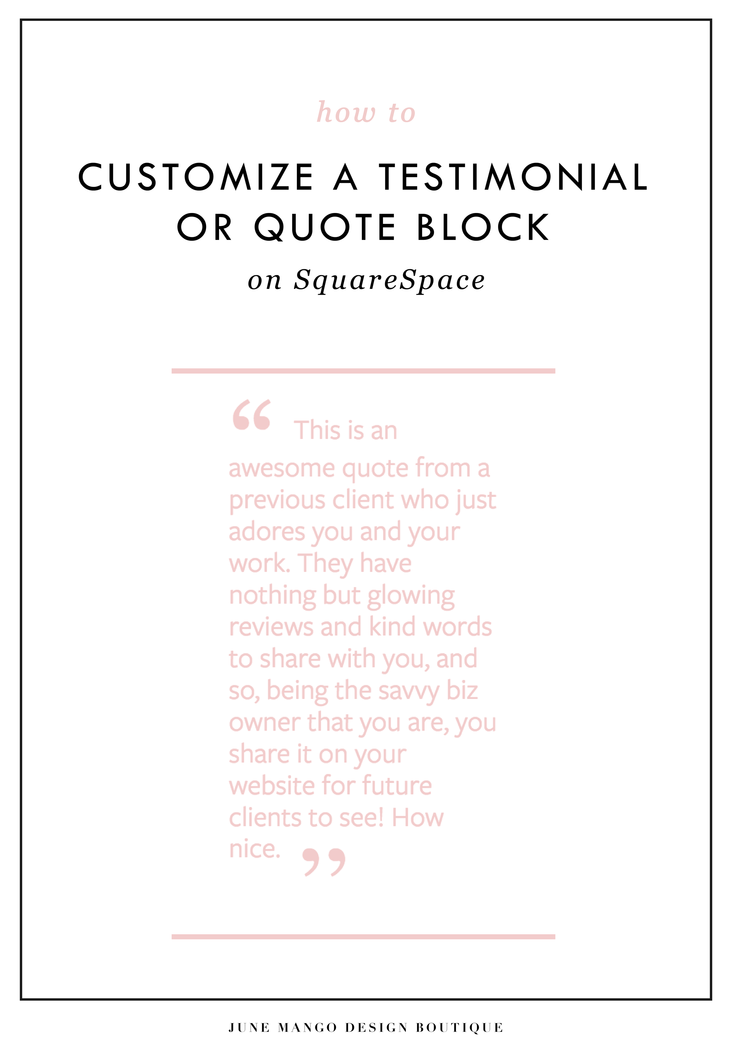
CUSTOM BLOCK QUOTES FOR SQUARESPACE TESTIMONIALS
What's that? You want more #squarespacehacks? Ya? Well you are in luck my frand. I've got a really cool one today that I'm pumped to share: Custom Block Quotes! This is so perfect for featured testimonials or important tidbits you want to call attention to on a sales page. So let's fancy up those boring old Squarespace quotes, shall we?
What's that? You want more #squarespacehacks?
Well you are in luck my friend. I've got a really cool one today that I'm pumped to share: Custom Block Quotes! This is so perfect for featured testimonials or important tidbits you want to call attention to on a sales page. So let's fancy up those boring old Squarespace quotes, shall we?
HERE ARE THE STEPS:
In the main Squarespace menu, click DESIGN. Then CUSTOM CSS.
Copy and paste the following code:
.newblockquote { background: #fff; border-top: 5px solid #F2CBCB; border-bottom: 5px solid #F2CBCB; margin: 1.5em 0px; padding: 0.5em 10px; quotes: "\201C""\201D""\2018""\2019"; color: #F2CBCB; font-size: 25px; padding-top: 35px; padding-left: 50px; padding-right: 50px; padding-bottom: 35px; }
.newblockquote:before { color: #F2CBCB; content: open-quote; font-size: 4em; line-height: 0.1em; margin-right: 0.1em; vertical-align: -0.4em; font-family: Volkhov, Georgia, Serif; }
.newblockquote:after { display: none !important; color: #F2CBCB; content: close-quote; font-size: 4em; line-height: 0.1em; margin-left: 0.1em; vertical-align: -0.6em; font-family:Volkhov, Georgia, Serif; }
.newblockquote p { display: inline; }
The pink highlighted text is where you can change your colors. Do not edit the other text. (You can also add this code to an individual page if you only want to see the effects on one page of your Squarespace site).
On the Squarespace page you'd like to add a quote block to, insert a CODE content block.
Paste the following code, replace the text with your own and then click save:
<p class="newblockquote">
This is an awesome quote from a previous client who just adores you and your work. They have nothing but glowing reviews and kind words to share with you, and so, being the savvy biz owner that you are, you share it on your website for future clients to see! How nice.
</p>
The pink highlighted text is where you can change your text and add your quote. Do not edit the grey text.
And that's it!
The following information was created for use with templates made with Squarespace 7.0.
Stay tuned for more tips and tricks for the new 7.1 platform!

LOGO PROCESS: ACUPUNCTURE BRANDING
I've had lots of new branding projects lately that I've been meaning to share! Two of these were for holistic health providers specializing in acupuncture + herbal medicine or yoga + massage. Here are the logo processes for both!
I've had lots of new branding projects lately that I've been meaning to share! Two of these were for holistic health providers specializing in acupuncture + herbal medicine or yoga + massage. Here are the logo processes for both!
Logo Process for Wildcrafted Acupuncture & Herbs - Submarks
Logo Process for Wildcrafted Acupuncture & Herbs - Logo
Logo Process for Align Massage and Yoga - Submark
Logo Process for Align Massage and Yoga - Logo
ADDING BORDERS AND BOXED TEXT IN SQUARESPACE
Another day, another Squarespace hack! This hack helps you add a cool border to your text to create a boxed text. This is great for when you want to call attention to certain text. Perfect for sales pages or even for testimonials or quotes! Read on for the full tutorial.
Another day, another Squarespace hack! This hack helps you add a cool border to your text to create a boxed text. This is great for when you want to call attention to certain text. Perfect for sales pages or even for testimonials or quotes! Read on for the full tutorial.
HERE ARE THE STEPS:
In the main Squarespace menu, click DESIGN. Then CUSTOM CSS.
Copy and paste the following code:
.fancyborder { border:4px solid #F2CBCB; padding: 10px; }
The pink highlighted text is where you can change your colors and width of the border. Do not edit the other text. (You can also add this code to an individual page if you only want to see the effects on one page of your Squarespace site).
Then on the page you're adding the boxed text to, insert a MARKDOWN block.
Add this code:
<div class="fancyborder">
All of your awesome text can go here! You can write as much or as little as you want! It's totally up to you, but no matter what you write, it will look super cool with your custom border! Boom.
</div>

Replace the brown text with your own. Click SAVE.
And that's it!! Easy peasy.
The following information was created for use with templates made with Squarespace 7.0.
Stay tuned for more tips and tricks for the new 7.1 platform!
NEW!
a templated guide to messaging magic
A plug-and-play website copy template for your four core pages (Home, About, Offerings, Contact). Save yourself hours of stress and get templates, examples, and expert guidance that will benefit your business and your bottom line.
learn more >

HOW TO CUSTOMIZE YOUR "READ MORE" LINK ON SQUARESPACE
I've got another little snippet of code for all you Squarespace lovers today! This one is for that boring old "Read More" link that appears on a Summary Block. Especially if you are using Squarespace's Summary Block to showcase your blog posts, the "Read More" link is often a good spot to get your audience to engaged (ie: so that they read more!) with your featured posts. So how do you take it from boring black text to something that matches your brand? I've gotcher back.
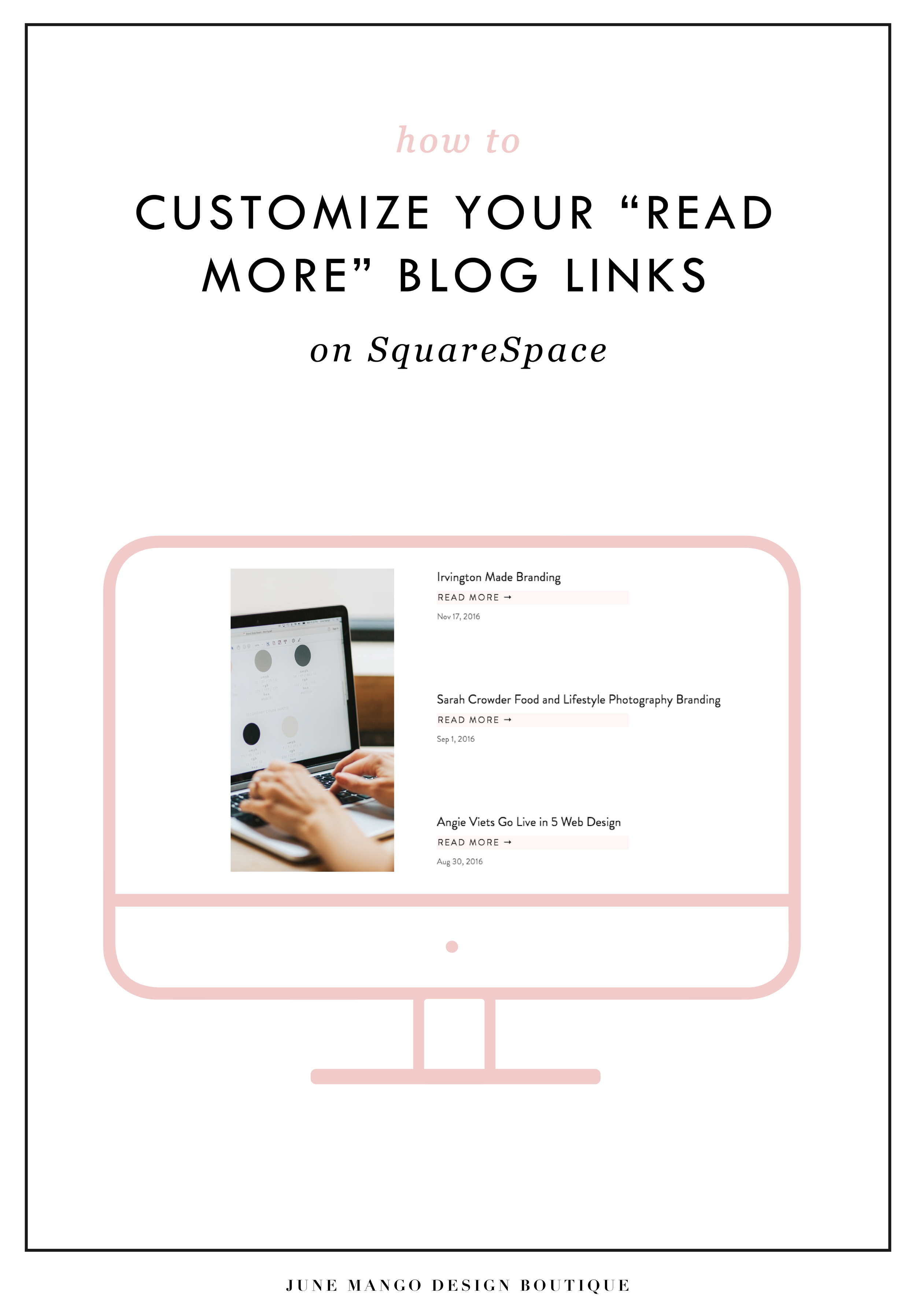
I've got another little snippet of code for all you Squarespace lovers today! This one is for that boring old "Read More" link that appears on a Summary Block. Especially if you are using Squarespace's Summary Block to showcase your blog posts, the "Read More" link is often a good spot to get your audience to engaged (ie: so that they read more!) with your featured posts. So how do you take it from boring black text to something that matches your brand? I've gotcher back.
There are a few little code changes you can make to jazz up the plain "Read More" to match your branding colors. Here are the steps:
In the main Squarespace menu, click DESIGN. Then CUSTOM CSS.
Copy and paste the following code:
/*** READ MORE LINK - TEXT ***/
.entry-more-link a:not(.sqs-block-button-element) {
color: #F2CBCB !important;
}
.entry-more-link a:not(.sqs-block-button-element):hover {
color: #444444 !important;
}
The pink highlighted text is where you can change your colors. Do not edit the other text. (You can also add this code to an individual page if you don’t want it to affect all “Read More” links on your site).
IMPORTANT ! !
Each template has a different method to define their "Read More" links. Please select the method for your template below, and then replace the red CSS code (.entry-more-link) with your template’s method. (If you’re template isn’t listed below, please try the links below, - many work for more than one template. If none of these work, feel free to email me with your specific template at hello@junemango.com).
Adirondack:.link
Five: .inline-read-more
Fulton: .summary-read-more-link
Horizon: .summary-read-more-link
Peak: .read-more
Mohave: .summary-read-more-link
Marquee: .entry-more-link
And that's it!
The following information was created for use with templates made with Squarespace 7.0.
Stay tuned for more tips and tricks for the new 7.1 platform!
need even more help with squarespace?
Skip the overwhelm and have your website
designed and launched in just 5 days!

MAKING DESIGN TRENDS UNIQUE TO YOUR BRAND - PART 1
Can we just have some real talk right now? Ya? Ok, the thing is, there's a lot of design trends that are just being recycled. Over and over and over. The problem with this (besides being boring), is that the logos aren't actually making their brands standout. You deserve to be on trend AND have a logo that won't be seen anywhere else.
Can we just have some real talk right now? Ya? Ok, the thing is, there's a lot of design trends that are just being recycled. Over and over and over. The problem with this (besides being boring), is that the logos aren't actually making their brands standout. You deserve to be on trend AND have a logo that won't be seen anywhere else.
So how can you take these design trends you're crushing on and make them unique to your brand? I have a few examples below to help you do just that.
Design trend #1: Circular Stamps / Submarks

These work so well for businesses who literally need a stamp created for their business. They're succinct, versatile and sophisticated. So now let's make it more unique to your brand.


A: Change the shape! This could be a simplified shape of the brand's distinctive identity, like the logo by Yossi Belkin above, or something as simple as a hexagon, triangle, or scalloped edge.
B: Break the rules! I am a big fan of breaking design rules. It just makes things a bit more interesting, like this logo by Salted Ink. So bust the design elements out of the circular text or make your circle wrap around only 3/4 of the way closed. Just shake shit up a little bit and see what you can come up with.
Design trend #2: Monograms


A: Combine letters! Simplify, simplify, simplify. That's my #1 rule of thumb for design. When it comes to monograms, using the strokes of each letter and combining them can help you create a totally unique mark.
B: Sneak in the second letter!Using negative space and the natural lines of the letters, you can 'imply' where the second letter is. In the logo for web dev Kyle Acker above, the K is prominent, but the A is inferred. It makes you take a second look, which if you ask me, is the mark of a strong logo.
These are just a few ways you can take something that's ay-ok and up-level it to be something really cool and unique to your brand! I'll have more on this and other common design trend in Part 2 of this series.