MAKING DESIGN TRENDS UNIQUE TO YOUR BRAND - PART 1
Can we just have some real talk right now? Ya? Ok, the thing is, there's a lot of design trends that are just being recycled. Over and over and over. The problem with this (besides being boring), is that the logos aren't actually making their brands standout. You deserve to be on trend AND have a logo that won't be seen anywhere else.
So how can you take these design trends you're crushing on and make them unique to your brand? I have a few examples below to help you do just that.
Design trend #1: Circular Stamps / Submarks
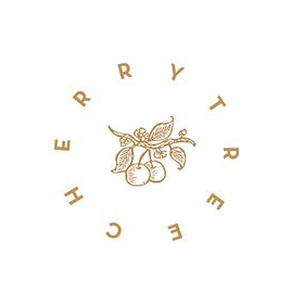
These work so well for businesses who literally need a stamp created for their business. They're succinct, versatile and sophisticated. So now let's make it more unique to your brand.


A: Change the shape! This could be a simplified shape of the brand's distinctive identity, like the logo by Yossi Belkin above, or something as simple as a hexagon, triangle, or scalloped edge.
B: Break the rules! I am a big fan of breaking design rules. It just makes things a bit more interesting, like this logo by Salted Ink. So bust the design elements out of the circular text or make your circle wrap around only 3/4 of the way closed. Just shake shit up a little bit and see what you can come up with.
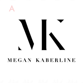
Design trend #2: Monograms
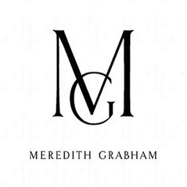

A: Combine letters! Simplify, simplify, simplify. That's my #1 rule of thumb for design. When it comes to monograms, using the strokes of each letter and combining them can help you create a totally unique mark.
B: Sneak in the second letter!Using negative space and the natural lines of the letters, you can 'imply' where the second letter is. In the logo for web dev Kyle Acker above, the K is prominent, but the A is inferred. It makes you take a second look, which if you ask me, is the mark of a strong logo.
These are just a few ways you can take something that's ay-ok and up-level it to be something really cool and unique to your brand! I'll have more on this and other common design trend in Part 2 of this series.